Anyway, here's what I was thinking about.
I was picturing myself at a Labour Party meeting, talking to someone with a cornucopian point of view, and wondering how I would explain why I thought their ideas were wrong. I remember talking Malthus at a Militant meeting way back in the mid or late 80's, and was assured that "We'd have reached the stars by then". I've found it to be a common view: The idea that more affluence for millions and billions of people is a noble goal to strive for. This bounteous Earth, with all it's riches should be a common treasury.
I agree, but I don't think that means the treasury is infinite.
So here goes, with diagrams. Why it's all ended up on the right hand side of this post I have no idea.
The circle is all the resources of the earth. Some of them are finite and non renewable.

This diagram represents how those resources are shared out.
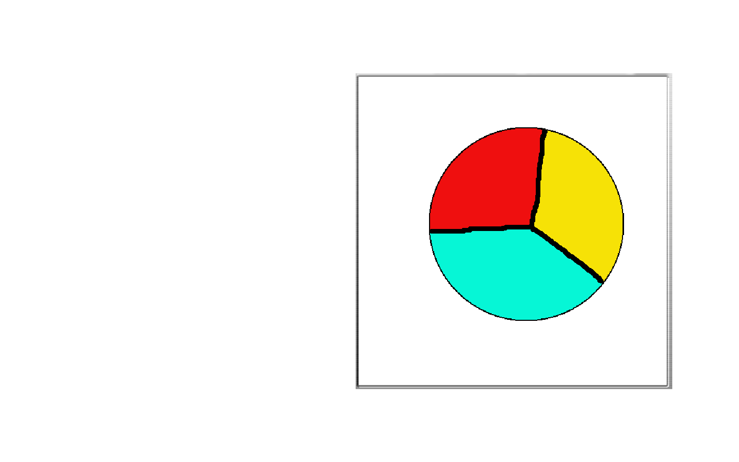
You could say that the blue represents the rich, the red represents the poor, and the yellow represents the resources needed to actually utilise those resources.
You might believe that the slices of the pie need to be wider or narrower depending on your worldview.

The inner ring represents the resources we need. The pyramid of needs becomes a bullseye here. The closer to the centre you get, the more it becomes about survival.
But the outer circle, which has been expanding over the last few centuries is about to start getting smaller. Marx never saw it coming. Neither did Adam Smith. How could they? When they were writing, those limits were way over the horizon.
driving lessons in North Wirral? learn to drive in Hoylake? driving instructor in Birkenhead?
No comments:
Post a Comment